Wednesday, 29 February 2012

David Cotterrell: Monsters of the Id at the John Hansard Gallery

 Entering the John Hansard Gallery you walk into a large open space, of which one wall is a smooth curved surface with a projection of sandy hills. This space is called 'Observer Effect'. Once in the room, sensors detect your appearance which causes human figures to show on screen, that walk towards you in a confrontational manner. Yet they stop, and stand. They fidget, scratching their arms, looking around, but that is all. When the room is busier, more figures appear in relation to what activity is going on. The two spaces, projected and reality, are connected.


This work is based upon Cotterrell's experience in Afghanistan, but how? There's no guns, there's no blood. This is a different and challenging view of the medias representation of the war. The relation between the viewer and the work, makes you feel linked and part of the scene. The theme of connection carries on and you walk into a second room 'Searchlight 2', of which a tonne and half of chalk has been moulded into a terrain landscape which mimics the landscape in the first. Little figures are projected onto the surface that move around. You begin to question who these figures are, soldiers? Civilians? Humans none the less.


The third room is two dome shaped walls, as if you're standing inside a ball called 'Apparent Horizon' which simulates the landscape of this work. Clouds flow over that are mathematically made and never repeat themselves, like reality. The ground moves as if you're walking through it. This is to imitate the military simulation programmes used. The calm atmosphere gives you time to consider the other side of war that we do not see. The part that there are civilians living amongst these wars and there are soldiers that dont just shoot guns and throw bombs. The technology used is all to recreate the war, so is this all supposed to be like a game or is it reality? We feel connected to what is going on, as our presence in this space is connected to what we see.

A final room is set-up like a surveillance room, and it's in here that you think about the idea of control. Is this equipment, that is real and what is used by the military, supposed to be a recreation, or is it part of a game that controls the war, or is controlling the area inside the gallery? A very imaginative and thought provoking installation by Cotterrell that leaves me wondering still if its all a synthetic creation or reality.


Friday, 10 February 2012

Charlotte Cotton, The Photograph as Contemporary Art.

In the past 9 months, this book has become my little hand book. It has SO much information in it, it's amazing. It makes everything accessible and understandable and covers so many aspects of contemporary photography. It is certainly one that I recommend!

One chapter that i have looked at in seminars at uni is 'Once Upon a Time' which is the 2nd chapter of the book. Here, Cotton discusses the way in which photographers apply narrative to their images. She flows from one piece of work to another making it a very easy and comprehendible read - I really cant stress how valid this book will be to any one studying photography or art, and can be bought so cheaply on amazon! 


Monday, 6 February 2012

Taylor Wessing Portrait Prize

The last time i went to the TW Portrait Prize was to see the 2009 exhibition, which was a real insight to me as to what made a successful portrait as i was just starting out to explore photography at A-level. Two that stood out for me in the room were: 

Red/White 2009 by John Brennan

Self Portrait With Chickenpox 2008 by Garth Walker

For me, in these images, it was what i personally connected to with them. For example, Brennan's as it had recently snowed before id seen the image and had taken pictures similar, and Walkers as after the exhibition i had a skin condition and took a picture inspired by his work. So what did i see this time round and what caught my attention most?


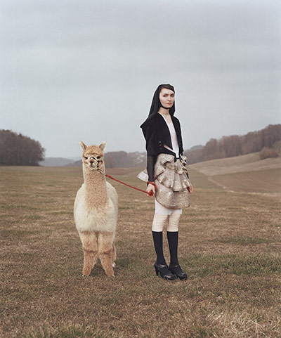
Tatiana and Belene, from the series Venus & Furs, 2011, by Yann Gross
Melinda,  2011 by Tina Hillier.
With Gross's image, it was the idea behind that got me. Being a swedish man, he used a swedish model and was shooting in swedish country side, but used the exotic animal and interesting clothes for a fresh approach to something that could have seemed quite traditional otherwise. There seems to be a connection in the image tonally as the colour palette is fairly simple, but the character of the animal and model seem to me quite amusing. Looking as if they dont want to be there and somewhat out of place, i couldn't help but smile when i saw this image in the gallery.

And then there's Hillier's image which i was drawn to by her use of lighting. The soft yellow light felt warm and comforting against the cool blues of the wall. The background behind the image was that Melinda is an artist and this picture was taking the morning that her work was going to exhibited. In that respect, the soothing tones of yellow make you feel relaxed about what's to come, something that can be nerve-wracking.

I really enjoyed my time at the gallery, however i left the actual winners till last to look at. The way i had worked my way around the room was to approach each image and take in what i could first hand, and to then read the description connected, and then look back at the image and see if there was anything new that came to it. I felt that when i looked at the winning image (Harriet and Gentleman Jack, 2011 by Jooney Woodward) not a lot of excitement came to mind. Yes the colours were pleasing, and the focus, but subject wise i didn't feel a lot! 
Harriet and Gentleman Jack, 2011, Jooney Woodward.


So now im left wondering, what does make a good portrait? Well hopefully my portrait project for this semester will let me explore and adventure into the depths of portraiture photography!

Wednesday, 1 February 2012

Let The Adventure Begin

This is a blog that will track my progress in the 2nd unit of my Photography Degree. Part of it is to learn how to blog like the professionals do (my current standards are probably that of a 15 year old who just writes about their friends) and to also discuss and review what i've seen and learnt as i make my way through my degree.

So to get started, i obviously had to make the blog. From having looked at others, i found i was mainly drawn to the simple and plain ones, because they're easy to read and not intimidating to look at - so keeping this theme was key. I went for a white background with the simplest, most basic template available and chose a dark plum/charcoal colour for text to add something a little more than a monochrome theme.

Finally feeling satisfied with my layout design, i'm off to make notes and think about what's to come next. Most likely a review of the Taylor Wessing Photographic Potrait Prize which i visited this week! Till next time :) x